
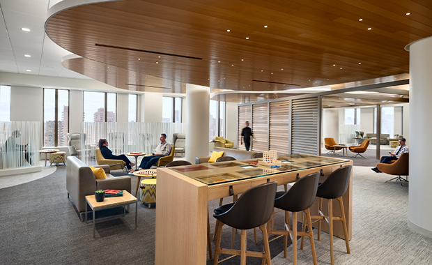
At 750,000 square feet, the David H. Koch Center for Cancer Care at Memorial Sloan Kettering Cancer Center (MSK) in New York houses comprehensive services across specialties, allowing patients to streamline appointments and reduce travel time and stress. A hospitality-inspired environment and integrated technology are hallmarks of the design that answer the unique needs of this patient population by providing lots of choice, control, and dignity. The project, completed in January, also thoughtfully responds to the cancer facility frequently serving as a second home to patients by offering a collection of varied environments and experiences. The jury lauded elements that considered how patient time is spent there and worked to improve upon it, as well as the thoughtful solutions delivered for both family/caregivers and staff.
The project was submitted to the Design Showcase by Perkins Eastman Architects, Ennead Architects, and ICrave (all of New York). Here, Suzen Heeley, executive director, design and construction at MSK; Mary-Jean Eastman, vice chair of Perkins Eastman; and Lionel Ohayon, founder and CEO of ICrave, share their perspectives on some of the design elements most appreciated by the jury.
Healthcare Design: Our jury loved the hospitality aesthetic of the project. How did you identify this design vision?
Suzen Heeley: Our global design vision places the patient at the center of everything we do. The design must always support our mantra, providing a “warm welcome” and a “thoughtful send-off” and presenting opportunities for moments of inspiration, surprise, and delight. The in-house design team plays a major role in establishing the vision, setting the design criteria, and shepherding it along every step of the way as it develops, ensuring the integrity of the vision is maintained. It’s also critical to specify durable, bleach-cleanable materials that will endure time.

You engaged patients and staff in the design process. How was their feedback translated to the design?
Heeley: We all knew this building would be completed six years from the time we began planning, so a futuristic vision was imperative. We heard from patients, clinicians, doctors, and staff, who said:
• “We want it to be an international beacon.”
• “The patient should leave feeling : ‘it was about me.’”app
• “Historically, clinics were designed for the doctors, not the patients. This model needs to change that.”
• “Give patients control.”
• “Let the building come to the patient.”
• “We want the Apple model—completely new and change the way people do things.”
These voices represented a host of thoughts we distilled into pillars, which represent the basic underlying belief for the project: We Heal, We Care, We Understand.
When diagnosed with cancer, patients immediately feel a loss of control. The design must present every opportunity to restore a sense of control back to the patient. We integrated bedside (inpatient) and chairside (chemotherapy) tablets that enable patients to control room temperature, video conference with family, order food, shop in the retail store, control window treatments and lights, watch on-demand entertainment, and more.
We’ve also made a distinct effort to break down physical barriers and create more personal interactions at check-in, in exam/consult rooms, at checkout, etc., by eliminating massive reception desks and outfitting staff with mobile devices, allowing them to go to the patient versus the patient going to them.
The overall feeling of the building was intended to be a disarming, warm, and engaging one. The anti-hospital, with a hospitality vibe. Technology played a large part in allowing the design to take new directions.
Cancer patients may experience “fatigue of the same” by visiting the same facility again and again. How did you remedy this via design?
Mary-Jean Eastman: Cancer patients spend a lot of their lives in a facility, and each visit may include diagnostics, treatment, and consultations with clinicians. There is often waiting time between appointments. The institution and design team had used real-time locating system technology on a previous ambulatory surgery project and felt it would facilitate patient and family use of all the lounge and food services in this new building and eliminate anxiety related to being in the right place for the next
appointment.
Lionel Ohayon: We focused on creating a place that inspires, developing three design typologies for common spaces that are grouped as neighborhoods: restoration, recreation, and activation. As their names imply, each is crafted to engage and support a broad array of activities for the patients and their caregivers. The palette was derived as a backdrop to the experiences and choices that patients would have. We used lighting as a strategy to define spaces and create boundaries in lieu of defining spaces with walls. Color was added as an accent and not a primary focal point to the space. The intent is to allow for discovery and not to think of any space being designed for waiting.
A small space that had a big impact on our jury is the “Get It Together Room,” a place where patients can pause to gather themselves before leaving the building. How did you approach its design?
Heeley: Borne of a need at an existing ambulatory care facility off-site, an MSK greeter noticed patients who had just received a diagnosis were hesitant to exit the building without first pausing. He could read their expressions and would escort them aside to a private space where they could gather themselves before going back out into the world. These spaces were intentionally positioned at both lobbies, providing patients with a respectful, private place.
Jennifer Kovacs Silvis is editor-in-chief of Healthcare Design. She can be reached at [email protected].