Healthcare designers and planners develop master plans that peer into an organization’s foreseeable future and develop built environment solutions that respond accordingly to the needs that are identified. Healthcare communications professionals perform a similar exercise, except their response is the development of communication strategies that engage and inform patients, staff, and visitors on changes to come. A comprehensive wayfinding strategy lives at the intersection of these two disciplines.
As part of its master plan,
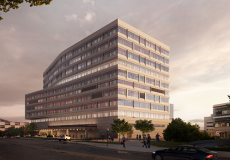
Memorial Medical Center (MMC) in Springfield, Ill., engaged in a major facility expansion. The project included an updated energy plant, a new Center for Learning and Innovation, an expanded surgery center, and a new patient care tower attached to the original structure, which resulted in changes to the facility’s front door and main lobby.
Completed in November 2015, the new campus additions required holistic changes to communications and internal management that supported updated wayfinding logic created through the design. To that end, an internal wayfinding team worked alongside BSA Life Structures, the architect/interior designer, and Corbin Design, the wayfinding design firm. Together, they used these five building blocks to streamline the process, balancing intuitive architectural cues with wayfinding information.
1. The logic of the environment
The challenge for any wayfinding system is that it must help a first-time visitor understand the logic of the physical space. However, as the master plan unfolded at MMC, even patients who were familiar with the campus needed to understand the changes that had been made—they became new visitors, too.
For example, the main entrance experience was transformed as the new patient tower was erected: Now, the front door to MMC is sited to serve as a monumental landmark that intuitively draws people from a distance with architectural cues, landscaping, lighting, and the MMC brand. Previously, a red brick façade matched much of the surrounding building structure with a low, curved canopy to identify the main entrance, which, given the local tree canopy, wasn’t very visible from the road.
New signage is a similar departure: Since other healthcare destinations on the campus aren’t owned by MMC, the original signage organized different locations by color and type. This added visual clutter and confused drivers. Now, all destinations are visually treated equally except for emergency, which appears in a red field. Information is organized alphabetically by arrow direction (left, right, and straight) so that drivers can prepare for turns ahead.
At the same time, the interior wayfinding logic evolved, as well. The surgical services pre-admission unit was relocated adjacent to the main lobby, selected inpatient rooms were moved to the new patient tower, and elevators were redefined. The previous wayfinding system had identified three public elevators (Capitol, Lincoln, and Garden) and one service elevator (Elevator B), often used by the public and located close to Capitol. Since the design of the new lobby opened up the line of sight to the Capitol elevators, they were renamed Main Elevators and Elevator B was renamed Capitol.
As elements of this scale were completed, new wayfinding logic was introduced in phases and required integration into the existing wayfinding scheme.
MMC had invested heavily in the legacy wayfinding system that included three linear zones that were described with names, colors, and the elevator icons of Capitol, Lincoln, and Garden. Each zone was supported with interior design color ways that included finishes and artwork: For instance, the green Garden Zone included artwork that primarily used green tones and garden themes, and the Garden icon had been integrated into terrazzo flooring. Each zone appeared on each building level, and departments were identified by the zone they occupied. In order to save costs and reduce internal interruptions, it was important to retain this basic organization.
Since elevators serve as landmarks for orientation and are used for circulation, the updated logic eliminated the zones and centered on elevator cores only. Rather than being located in a zone, interior destinations are identified as located near a particular elevator, easier to identify and remember. The elevators retained the original icons, adding an international symbol for elevator, and used brighter colors for better distance viewing. In many cases wayfinding information replaced the original artwork throughout the facility.
2. The cultural language
The renovation of the main entrance and lobby introduced a change in the way that the wayfinding logic is described verbally, too—for example in the names used for elevator banks, as noted previously.
This allowed MMC to remove the zones from its wayfinding language, focusing instead on referencing the public elevators for wayfinding. All public circulation now takes place along first-floor hallways with landmarks described being the elevator closest to a visitor’s destination, based on floor and room number.
The project team also addressed existing wayfinding terminology that could potentially be confusing. For example, the special procedures area had been shortened to “SPA” by most staff and volunteers, but a visitor’s expectation of a “spa” was very different. The project team undertook a complete review of destination names and commonly used acronyms to make them more visitor-friendly.
3. Communication tools
One benefit to implementing a large master plan is that awareness of impending change becomes part of an organization’s culture, and new or updated tools can be introduced to support communications efforts. At MMC, the communications team built a phased strategy using digital and printed media targeted to internal and external audiences, which included a website that was updated at regular intervals. Not only did this inform staff and visitors of upcoming changes, but it built a buzz around the new construction and helped everyone understand the reasons for change.
For example, as the project was underway, it required exterior circulation and parking to be reflowed. Temporary construction routing was managed by communication with staff and patients via internal channels, an external project-specific blog, press releases, print ads in local media, as well as external signage.
Simplified maps, international symbols for amenities, and a new strategy for organizing destinations on wayfinding signage resulted in more legible, relevant, and understandable content. For instance, internal destinations on signage are mostly limited to primary destinations or room number ranges, which are less likely to change; the previous system featured multiple internal destinations that required labor-intensive updates each time a change occurred. As with exterior signs, destinations are now consistently grouped alphabetically by arrow direction. These conventions reduce the amount of visual clutter, allow for more legible typography, and keep navigation consistent across the campus.
4. Staff education
For everyone at MMC, understanding the master plan and the resulting new logic, terminology, and tools was the most critical aspect of completing the wayfinding strategy. If these had not been introduced into the organizational culture, they might have fallen short of their potential effectiveness. This internal training needed to take place so that anyone, regardless of their position, could be called on to help a visitor find their way using new wayfinding language. All potential touchpoints with a visitor were covered: verbal instructions, printed directions, digital information, and signage.
MMC worked to ingrain the new wayfinding logic in the staff culture, updating employee orientation materials, publishing articles in staff newsletters, distributing fliers to all departments, developing new printed wayfinding guides for information desks, and updating maps used online and in printed materials. Periodic emails were sent to managers to remind them of the new logic and upcoming changes. This information was regularly shared in staff meetings and posted in staff areas, as well.
The essential steps of a patient journey are now simply communicated based on campus entrance, visitor parking, building entrance, elevator, floor, and destination.
5. Systems maintenance
Just as the new building came with operational and maintenance realities, the wayfinding system did, too. The internal wayfinding team that shepherded the process from start to finish was additionally tasked with maintaining the system. Facilities, public relations and communications, operations, and administration now all work in concert to maintain the information in the areas they control: print, digital, signage, and education. Without this critical internal collaboration, the system might once again become fragmented as ongoing campus changes occur.
The design of the process was as critical as the design of the final product; the cultural changes were as important as the physical changes. By thoughtfully considering each of these building blocks, MMC now has the physical and communications infrastructure to maintain an optimal patient experience.
Kelsea Gurski is system director of public relations and communications at Memorial Medical Center in Springfield, Ill. She can be reached at gurski.kelsea@mhsil.com. Linda S. Jones is vice president of operations at Memorial Medical Center. She can be reached at jones.linda@mhsil.com. Mark VanderKlipp, EDAC, is the former president of Corbin Design.