
When Lucile Packard Children’s Hospital Stanford opened in 1991 in Palo Alto, Calif., the 250,000-square-foot building housed some progressive design features for that time: a rooftop deck, 26 outdoor terraces, a central interior courtyard, and child-friendly artwork for wayfinding. Those features as well as the overall environment created were highly valued by patients, families, and the community, even as the functionality of the building struggled to meet the needs of contemporary clinical care. “People love the experience of being at Packard,” says Robin Guenther, principal at Perkins+Will (New York.) “It wasn’t a building that they couldn’t wait to get out of.”
The building, designed by noted healthcare architect Derek Parker and his colleagues at firm Anshen + Allen (later acquired by Stantec), evolved into an academic medical center, part of Stanford University, and had to accommodate a larger patient population. “When the original hospital opened, a lot of our surgery and imaging was at Stanford Hospital,” says Jill Sullivan, vice president of hospital transformation and vice president of strategic planning and general services at Lucile Packard Children’s Hospital Stanford. “Over time, we took over any space we could, and we built out surgery and imaging and as many beds as possible. But then we ran out of places to go.”
The nonprofit children’s hospital, part of Stanford Children’s Health, provides primary care as well as rare and complex specialty care for pediatric and obstetric patients, with leading programs for treatment in cardiovascular, transplant, cancer, pregnancy, and newborn care.
Lacking space and seeking to update the facility’s semi-private patient rooms and small nursing units, the organization began working with design firm Perkins+Will in conjunction with executive architects HGA and engineering firm Mazzetti+GBA on a 150-bed expansion. The goal was to create a facility that’s inspired by the legacy of the existing structure but designed for 21st-century medicine, with flexibility to adapt to future changes in care delivery, patient needs, and technology advancements.

“Our task was to make [a hospital] that would hopefully operate for 50 years, instead of 30, but preserve the spirit and the experiential qualities of the original building,” says Guenther, who was project director for the expansion project.
Staying flexible
Planning and design on the expansion began in 2006, with the original approach calling for the expansion to be sited on a corner near the existing hospital, with two new bed towers parallel to each other—one for ICU and the other med/surg. “That wasn’t considered positive from a family point of view,” Sullivan says, because the view from some of the patient rooms would be into the other tower. Additionally, Lucile Packard planned to operate the new and existing buildings together, including linking the surgery and imaging departments in both buildings. “When sited at the corner, although connected, the [new] building didn’t really relate to the existing hospital,” she says.
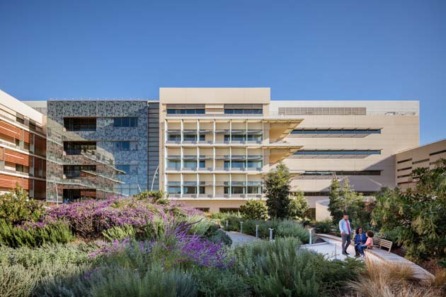
A year into the project, the design team decided to revise the plans, shifting the building massing away from the corner and closer to the original hospital (renamed the West Building), and changing the layout of the new hospital (called the Main Building) to a “Z” shape so the two towers would be staggered. This modification not only ensured that each room had a view of nature, but also created space for three gardens, including a public-oriented setting at the corner, a staff garden next to the hospital, and a more private setting between the West and Main buildings. “That [private] garden has been embraced now as the new heart of the campus,” Guenther says.
To deliver flexibility for future care needs or equipment upgrades, the inpatient floors in both the med/surg tower and the ICU tower were designed to support a transition in room type with minimal construction, says Amy Douma, healthcare designer at HGA (Minneapolis) and a medical planner for the project. “There’s adaptability in both room layouts and room size, and that will serve them long term should their needs change.” Another feature supporting flexibility is the location of the building’s major hard infrastructure elements, including IT and electrical components, in a spine that runs between the two bed towers and is positioned so those elements can be expanded without disturbing the patient care areas.
The project also came with some inherent construction complexities thanks to a constricted site, requiring the new towers to go up right next to the existing—and operational—hospital. “The guideline given to us by our executive team was that we couldn’t take any beds out of service during construction because we were so full,” says Michael Lane, vice president of construction for Lucile Packard Children’s Hospital Stanford.
During construction, Lane says two tower cranes were brought on-site, one for each tower, because “everything of any substance had to be craned in and out of the building until we got to a point where we could actually drive into the site.” Additional logistical challenges included planning the loading requirements for the 3.5 acres of garden space that would be built on the structure, including a green roof located above the surgery and imaging departments. The team also had to construct seven physical connections between the Main and West buildings—four on the ground floor, which connect the surgical and imaging departments, and one each on levels 1, 2, and 3. To overcome this challenge, a separate contractor with experience working in the existing building was hired to focus on the links in the West building so that DPR Construction, the contractor on the expansion, could focus on the larger project.
Opened in December 2017, the eight-story, 521,000-square-foot expansion features three levels of underground parking, which includes a discharge lounge where inpatients can wait to be picked up rather than going through the main lobby. The main entrance, lobby, and surgery department are located on the ground floor—a layout that accommodated Lucile Packard’s desire to expand its surgery department by aligning the new and existing ORs on the same level, while also ensuring that none of the hospital’s clinical areas are below ground.
The entry lobby features a 20-foot glass wall overlooking a garden on one side and an elevator well and staircase on the other. The first floor houses most of the public functions, including the cafeteria, café, gift shop, and sanctuary, which are shared between the Main and West buildings.
The four inpatient floors, located on levels 2 to 5, house private rooms with expanded accommodations for families, including a built-in sofa bed, family closet, storage space, and a laptop charging station. Keeping in mind that many patients and their families might face extended hospital stays, there’s a family kitchen and laundry on every floor.
Source of inspiration
One of the features from the original hospital that designers wanted to translate to the new building was access to nature. Parker’s design featured a terraced building form with multiple balconies outside patient rooms. Rob Goodwin, principal at Perkins+Will (New York) and lead designer on the project, says the use of terracing wasn’t something that would work this time around because of space constraints and the repetitive nature of the floor plates, so designers instead tried to “preserve the idea that every patient could have a glimpse of nature,” by lowering the window sills in the inpatient rooms and installing planters outside each window with native plantings to attract birds and insects.
“It creates a direct relationship between the idea of healing and the experience of nature,” Goodwin says. There are also two outdoor balconies on each inpatient level—one for patients and families and one for staff.
Nature is also a defining feature of the hospital’s wayfinding program. Inspired by the West Building’s ocean-inspired approach, each floor of the new building is identified by a specific color and theme that represents one of California’s eco-regions, including mountains, foothills, desert, valley, redwood forest, rocky shore, shallow water, and deep ocean. “We made sure that the colors aligned so that as families crossed over between the buildings, they understood the wayfinding from a color perspective,” Lane says.
Floor-to-ceiling murals sharing facts about the animals and their habitats are located at each care unit entrance, simplifying navigation and adding a dose of education. “Lucile Packard leadership wanted the building to be a teaching tool as well as a patient care environment, because they believe that learning stimulates healing,” Guenther says. Animals and nature imagery also appear in floor graphics, artwork, and sculptures located in the lobby and at key meeting points to serve as wayfinding as well as positive distractions.
“I see kids in the lobby of the building go from animal to animal, petting them, lying next to them, sitting with them,” Guenther says. “It’s amazing to watch.”
Green light on sustainability
As much as the project team looked to the past for inspiration, its sights were also set on incorporating forward-thinking, sustainable design features, including water- and energy-saving systems that support green efforts embraced by residents of the region due to recent drought conditions. “They wanted us to push this facility to be innovative and provide proper care while at the same time be very sustainable and a little a bit of a laboratory,” says Dan Rectenwald, COO and executive architect at HGA and the firm’s principal-in-charge on the project.
With an owner thirsty for innovation and cutting-edge solutions, Arash Guity, chief energy engineer and associate principal at Mazzetti+GBA (San Francisco), says the firm presented Lucile Packard with its research findings on the efficacy of displacement ventilation in healthcare settings, which it had conducted a few years prior to the project’s inception. “This is a system that has the potential for significant energy savings and improved indoor air quality, which is specifically of interest in a healthcare setting,” he says.
While the system has been adopted in most building types, few healthcare facilities in North America have installed it because of concerns about infection control, Guity says. “That’s why we had to do the peer-reviewed research.”
Specifically, he says the research proved that lower ventilation rates could be used for a displacement ventilation system, while maintaining or improving indoor air quality and infection control potential through a more effective means of contaminant removal. “As a result, the displacement ventilation system uses almost half as much total energy for ventilation of the spaces where it’s applied,” he says. The engineering firm also met the project team’s request for a third-party mechanical engineer to review the proposed design to provide unbiased feedback. “It was that endorsement that helped to make the case to include it in the design,” Guity says. (For more on the displacement ventilation system at Lucile Packard Children’s Hospital Stanford, including how it was used in patient rooms, click here.)
Also working behind the scenes at the hospital is a 110,000-gallon cistern system that’s been designed to store, filter, and reuse water collected from rainfall, condensate from the building’s mechanical equipment, and water purified through reverse osmosis for hemodialysis, to irrigate all the landscaping. Overall, the hospital is designed to reduce energy consumption by 38 percent and water consumption by nearly 40 percent over building code. While it’s too early to tell if the building is meeting those expectations, this past spring, the hospital achieved LEED Platinum certification from the U.S. Green Building Council. (For more on the project’s sustainability initiatives, read “Sustainability By The Numbers” below.)
Aiming high
With the hospital expansion completed, Lucile Packard Children’s Hospital Stanford is now turning its eyes to the iconic original building for upgrades. “We’re looking at what needs to change and what features from the Main Building we want to carry over to the West Building,” Sullivan says.
But the organization already feels it’s on the right track in delivering a better patient experience, including the use of private patient rooms, multiple points of access to nature, and family-friendly amenities. “Our [patient satisfaction] scores have gone up dramatically with opening this building because there are places for families to be,” Sullivan says.
Guenther attributes much of the project’s success to the commitment by the owner and the design team to set high goals right from the start 10 years ago. “If you don’t aim high, you’re not going to cut the ribbon on anything innovative,” she says. For example, when the team first proposed the water reclamation system, many in the design community were skeptical. “Then the California drought happened, and it became the most newsworthy aspect of the building while it was under construction,” she says. “We don’t know the future when we start designing these buildings, but I think it’s important that they carry audacious goals.”
Anne DiNardo is executive editor of Healthcare Design. She can be reached at [email protected].
Sidebar: Sustainability by the numbers
Lucile Packard Children’s Hospital Stanford is the second children’s hospital—and the fifth new-build hospital in the world—to achieve LEED Platinum certification from the U.S. Green Building Council. Here’s a look at some of the project’s stats:
700,000 gallons of water saved each year through the rainwater harvest system
3.5 acres of gardens and open space
38% reduction in energy consumption
45% reduction in energy costs
38% reduction in water consumption
>28% of building materials contain recycled content
26% of building material was extracted or manufactured within 500 miles of Palo Alto, Calif.
90% less carbon emissions than the average U.S. hospital of the same size
Project Details:
Project name: Lucile Packard Children’s Hospital Expansion
Completion date: December 2017
Owner: Lucile Packard Children’s Hospital Stanford
Total building area: 521,000 sq. ft.
Total cost: N/A
Total cost/sq. ft.: N/A
Executive architect: HGA
Design architect: Perkins+Will
Sustainability: Perkins+Will
Structural engineer: Degenkolb
Civil engineer: Sandis
MEP engineer: Mazzetti+GBA
Low voltage/security: Teecom
Medical equipment: CallisonRTKL
Landscape: AECOM
Graphics/signage: Kate Keating Associates
Art consultant: Aesthetics, Inc.
Construction manager: DPR Construction
Artwork: Linda Nye, Pokey Park, Gary Drostle, David Landis, Michael Green
Carpet/flooring: Tandus-Centiva, Nora
Ceiling/wall systems: USG Ceilings, Ceiling Plus
Doors/locks/hardware: Schlange
Fabric/textiles: Carnegie, Momentum, Pallas, Pollack, Maharam, Designtex, CF Stinson
Furniture—seating/casegoods: Arcadia, Fresh Coast, Summit, Hightower, Herman Miller, Knoll, Steelcase, Nemschoff, Coalesse, IOA Healthcare, Dauphin, Montbleu & Associates
Handrails/wall guards: CS Group
Lighting: Bocci, Bartco Lighting
Signage/wayfinding: Forms+Surfaces
Surfaces—solid/other: Inpro Corp., Ice Stone, Meltdown Glass
Wallcoverings: Carnegie, Designtex, Heath Ceramics